Creating custom Lookit frames
Getting Started
One of the features of Ember CLI is the ability to provide ‘blueprints’ for code. These are basically just templates of all of the basic boilerplate needed to create a certain piece of code. To begin developing your own frame:
cd ember-lookit-frameplayer
ember generate exp-frame exp-<your_name>
Where <your_name> corresponds with the frame name of your choice.
A Simple Example
Let’s walk though a basic example of ‘exp-cat-test’:
$ ember generate exp-frame
installing exp-frame
   create app/components/exp-cat-test/component.js
   create app/components/exp-cat-test/template.hbs
   create app/components/exp-cat-test/doc.rst
   create app/styles/components/exp-cat-test.scss
Notice this created three new files:
app/components/exp-cat-test/component.js: the JS file for your frameapp/components/exp-cat-test/template.hbs: the Handlebars template for your frameapp/components/exp-cat-test/doc.rst: a documentation page for your frameapp/styles/components/exp-cat-test.scss: a boilerplate file that exposes the new frame to the Ember app- you will almost never need to modify this file.
Let’s take a deeper look at the component.js file:
import ExpFrameBaseComponent from '../exp-frame-base/component';
import layout from './template';

export default ExpFrameBaseComponent.extend({
    type: 'exp-cat-test',
    layout: layout,
    frameSchemaProperties: {
         // define configurable parameters of your frame here in valid JSON Schema format.
         // See http://json-schema.org/latest/json-schema-validation.html#rfc.section.5
         // for what forms of validation are available. The frame configuration - i.e. the
         // object in the study JSON that defines a frame of this type - will be validated
         // against a JSON Schema {type: 'object', properties: frameSchemaProperties}.
         // Each property should have a YUIdoc comment as shown in the example below.

         /**
          * Whether to show a picture of a cat.
          *
          * @property {Boolean} showCatPicture
          * @default false
          */
         showCatPicture: {
             type: 'boolean',
             default: false,
             description: 'Whether to show a picture of a cat.'
         }
    },
    meta: {
        name: 'ExpCatTest',
        description: 'TODO: a description of this frame goes here.',
        data: {
            type: 'object',
            properties: {
                // define data to be sent to the server here
            }
        }
    }
});
The first section:
import ExpFrameBaseComponent from '../exp-frame-base/component';
import layout from './template';

export default ExpFrameBaseComponent.extend({
    type: 'exp-cat-test',
    layout: layout,
...
})
does several things:
imports the
ExpFrameBaseComponent: this is the superclass that all ‘frames’ must extendimports the
layout: this tells Ember what template to useextends
ExpFrameBaseComponentand specifieslayout: layout
Next are the parameters and ‘meta’ section:
 ...

 frameSchemaProperties: {
     showCatPicture: {
         type: 'boolean',
         default: false,
         description: 'Whether to show a picture of a cat.'
     }
 },

 frameSchemaRequired: ['showCatPicture'],

 meta: {
     name: 'ExpCatTest',
     description: 'TODO: a description of this frame goes here.',
     data: {
          /**
          * Parameters captured and sent to the server
          *
          * @method serializeContent
          * @param {String} whatTheChildThoughtAboutTheCat Child response to cat
          */
         type: 'object',
         properties: {
             // define data to be sent to the server here
             whatTheChildThoughtAboutTheCat: {
                 type: 'string'
             }
         }
     }
 },
...
The frameSchemaProperties field should be the JSON Schema defining what configuration
parameters this ‘frame’ accepts. When you define an experiment that uses
the frame, you will be able to specify configuration as part of the
experiment definition. Any parameters in this section will be
automatically added as properties of the component, and directly
accessible as propertyName from templates or component logic.
The frameSchemaRequired field is a list of any values in frameSchemaProperties
that should be required to be defined by the user of the frame.
The ‘meta’ field is composed of:
name (optional): A human readable name for this ‘frame’
description (optional): A human readable description for this ‘frame’.
data: JSON Schema defining what data this ‘frame’ outputs. Properties defined in this section represent properties of the component that will get serialized and sent to the server as part of the payload for this experiment. You can get these values by binding a value to an input box, for example, or you can define a custom computed property by that name to have more control over how a value is sent to the server.
If you want to save the value of a configuration variables, you can reference it in both parameters and data. For example, this can be useful if your experiment randomly chooses some frame behavior when it loads for the user, and you want to save and track what value was chosen.
It is important that any fields you define in data be named in
camelCase: they can be all lowercase or they can be writtenLikeThis, but
they should not start with capital letters or include underscores. This
is because the fields from the Ember app will be converted to snake_case
for storage in the Postgres database, and may be converted back if
another frame in Ember uses values from past sessions. We are fine if we
go fieldName -> field_name -> fieldName, but anything else
gets dicey! (Note to future developers: some conversations about this
decision are available if this becomes a point of concern.)
Building out the Example
Let’s add some basic functionality to this ‘frame’. First define some of the expected parameters:
...
    meta: {
        ...,
        parameters: {
            type: 'object',
            properties: {
                title: {
                    type: 'string',
                    default: 'An adorable cat'
                },
                question: {
                    type: 'string',
                    default: 'Check here if you think this is an excellent cat'
                }
            }
        }
    },
...
And also the output data:
...,
    data: {
        type: 'object',
            properties: {
                answer: {
                    type: 'boolean',
                    default: false
                }
            }
        }
    }
...
Since we indicated above that this ‘frame’ has an answer
property, let’s add it to the ‘frame’ definition:
export default ExpFrameBaseComponent.extend({
    ...,
    answer: null,
    meta: {
    ...
    }
...
Next let’s update template.hbs to look more like a test trial:
<div class="well">
  <h1>{{ title }}</h1>
  <hr>
  <p> {{ body }}</p>
  <hr >
  <div class="input-group">
    <span>
      {{ question }}
    </span>
    {{input type="checkbox" checked=answer}}
  </div>
</div>
<div class="row exp-controls">
  <!-- Next/Last/Previous controls. Modify as appropriate -->
  <div class="btn-group">
    <button class="btn btn-default pull-right" {{ action 'next' }} > Next </button>
  </div>
</div>
In this silly example we don’t want to let the participant continue unless they’ve checked the box, so let’s change the footer to:
<div class="row exp-controls">
  <div class="btn-group">
    <button class="btn btn-default pull-right" disabled={{ excellentNotChecked }} {{ action 'next' }} > Next </button>
  </div>
</div>
Notice the new property excellentNotChecked; this will require a new
computed field in our JS file:
    meta: {
        ...
    },
    excellentNotChecked: Ember.computed.not('answer')
});
Adding CSS styling
You will probably want to add custom styles to your frame, in order to control the size, placement, and color of elements. Experimenter uses a common web standard called CSS for styles.*
To add custom styles for a pre-existing component, you will need to
create a file <component-name.scss> in the
styles/components directory of ember-lookit-frameplayer. Then add a line
to the top of styles/app.scss, telling it to use that style.
For example,
@import "components/exp-video-physics";
Remember that anything in ember-lookit-frameplayer is shared code. Below are a few good tips to help your new frame stay isolated and distinct, so that it does not affect other projects.
To protect other frames from being affected by your new styles, add a class of the same name as your frame (e.g.,
exp-myframe) to the div enclosing your component. Then prefix every rule in your .scss file with.exp-myframeto ensure that only your own frame is affected. Until we have a better solution, this practice will be enforced if you submit a pull request to add your frames to the common Lookit ember-lookit-frameplayer repo.To help protect your own frame’s styling from possible future style changes (improperly) added by other people, you can give new classes and IDs in your component a unique prefix, so that they don’t inadvertently overlap with styles for other things. For example, instead of
video-widgetandshould-be-centered, use names likeexp-myframe-video-widgetandexp-myframe-should-be-centered.
Researchers using your frame can force it to be shown fullscreen (even if that is not
the typical intended use) by passing the parameter displayFullscreenOverride. If you
have not also set the displayFullscreen property of your frame to true, then the
#experiment-player element will have class player-fullscreen-override but not
player-fullscreen, to allow display to more closely mimic what it would be in
non-fullscreen mode for things like forms and text pages.
If you create an (intentionally) fullscreen frame, then the element you make fullscreen will have class
player-fullscreen while it is fullscreen, which you can use for styling.
* You may notice that style files have a special extension .scss.
That is because styles in experimenter are actually written in
SASS. You can still write normal CSS just
fine, but SASS provides additional syntax on top of that and can be
helpful for power users who want complex things (like variables).
Using mixins
Sometimes, you will wish to add a preset bundle of functionality to any arbitrary experiment frame. The Experimenter platform provides support for this via mixins.
To use a mixin for video recording, fullscreen, etc., simply have your frame “extend” the mixin. For instance, to use the VideoRecord mixin, your component.js file would define:
import ExpFrameBaseComponent from '../exp-frame-base/component';
import layout from './template';
import VideoRecord from '../../mixins/video-record';

export default ExpFrameBaseComponent.extend(VideoRecord, {
    type: 'exp-consent-form',
    layout: layout,
    meta: {
        ...
    }
});
Your frame can extend any number of mixins. For now, be careful to
check, when you use a mixin, that your frame does not define any
properties or functions that will conflict with the mixin’s properties
or functions. If the mixin has a function doFoo, you can use that
from your frame simply by calling this.doFoo().
Below is a brief introduction to each of the common mixins, which are also each documented in the frameplayer docs.
FullScreen
This mixin is helpful when you want to show something (like a video) in fullscreen mode without distractions. You will need to specify the part of the page that will become full screen. By design, most browsers require that you interact with the page to trigger fullscreen mode.
MediaReload
This attempts to work around a quirk of how ember renders the page; see stackoverflow post for more information. We recommend implementing new frames to work with Ember’s intended patterns instead.
VideoRecord
Functionality related to video capture, in conjunction with the Pipe system, for which MIT has a license.
Documenting your frame
We use Sphinx to generate documentation of ember-lookit-frameplayer frames from documentation files directly in the repository. You can see the hosted documentation here.
To include documentation for your new frame, add a doc.rst file in its directory along with component.js and template.hbs. You can pattern this after existing frames’ documentation. It should include:
A general description of your frame
A screenshot of the frame, or a diagram outlining various phases/options
An example of using it (the relevant JSON for a study)
All parameters and their types
All data saved
Any events recorded
To check how your documentation will appear, run make html from the ember-lookit-frameplayer
directory.
Ember debugging
Values of variables used in your frame are tricky to access directly from the Javascript console in your browser during testing.
There’s an Ember Inspector browser plugin you can use to help debug the Lookit components. Once you’ve installed it, you’ll find it along with other developer tools.
Here’s how to find relevant data for a particular frame. Screenshots below are for Google Chrome.
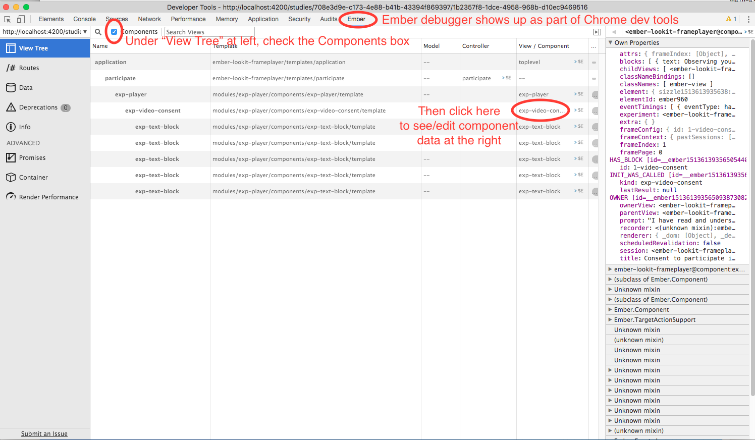
Ember debugger tree view
This lets you right away change any of the data you sent to the frame in the JSON document. E.g., on the consent page, try changing the “prompt” to something else. If something is going wrong, hopefully this information will be helpful.
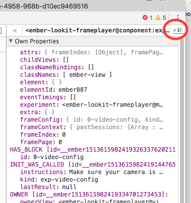
You can send the entire component (or anything else) to the console using the little >$E button:
Ember debugger send to console
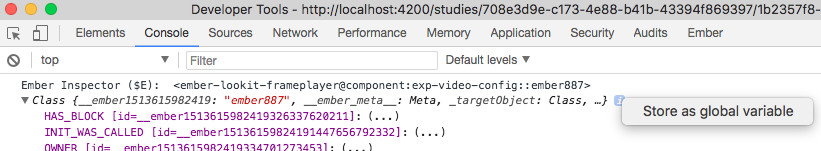
And then to keep using it, save it as a variable:
Ember debugger save variable
Then you can do things like try out actions, e.g. this.send.
When should I use actions vs functions?
Actions should be used when you need to trigger a specific piece of functionality via user interaction: eg click a button to make something happen.
Functions (or helper methods on a component/frame) should be used when the logic is shared, or not intended to be accessed directly via user interaction. It is usually most convenient for these methods to be defined as a part of the component, so that they can access data or properties of the component. Since functions can return a value, they are particularly helpful for things like sending data to a server, where you need to act on success or failure in order to display information to the user. (using promises, etc)
Usually, you should use actions only for things that the user directly
triggers. Actions and functions are not mutually exclusive! For example,
an action called save might call an internal method called
this._save to handle the behavior and message display consistently.
If you find yourself using the same logic over and over, and it does not depend on properties of a particular component, consider making it a util!
If you are building extremely complex nested components, you may also benefit from reading about closure actions. They can provide a way to act on success or failure of something, and are useful for : - Ember closure actions have return values - Ember.js Closure Actions Improve the Former Action Infrastructure